|
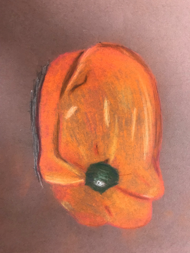
My drawing skills have definitely improved from the beginning of the semester and from art 1. I think that learning to slow down and really pay attention to every little detail and shape in something helped a lot. Also using reference photos helped because I was too stubborn in art 1 to use them and I think the fact I used them this semester helped my drawings look more realistic. I had never drawn in colored pencil or chalk pastel before and that entire unit was really helpful and learning how to incorporate colors that we don't see helped a lot. I really liked taking this class even though I was frustrated with my skill level and often times I was nervous to start something and mess it up. The still life project was probably my least favorite because there was just so much going on and it was really difficult to decide where to start and how to space everything. My favorite practice activity was the chalk pastel veggie drawing I did of the pepper. I think that having the actual pepper in front of me rather than a picture helped me see the colors I needed to include and all the details and textures that were on the pepper. My favorite big project was probably the Look at that View perspective drawing. I think my drawing ended up looking really good and all the colors looked nice even though the grass took forever to do all the individual strokes. What I got most out of this class is probably that as long as I stick to it I could probably become a better drawer and if I use reference photos and try not to think of the object as a whole I can draw object pretty realistically with practice.
0 Comments
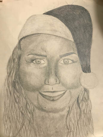
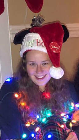
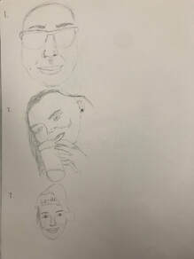
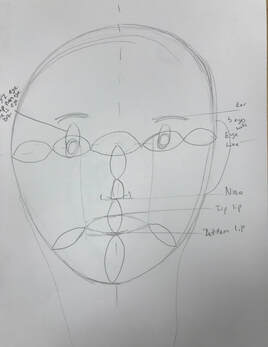
1. For my drawing I first had to find a picture that had my face head on and not to the side or turned at all. I first drew the general shape of a head and then measured out the placements for the facial features. I started with the eyes and eyebrows first. After the face and hat were done I did the hair and then finished with the neck. 2. The printed picture of the photo rather than looking at it on my phone helped me see the different values in the picture so that I could use them in the drawing. 3. My drawing did achieve a full range of value but it was difficult to do because it was really easy to make it too dark and not as easy to lighten the highlights. 4. Some parts of the drawing turned out decent but I think it has a long way to go. For one, it looks very creepy. The main problem with it is probably that I drew the cheeks to be too big. I had a difficult time drawing the hair and I think the way it frames the face is a little awkward. The lips were hard for me to draw because I hadn't practiced lips in an open mouth smile before could be part of the problem. It was also difficult because my upper lip seemed to disappear when I smiled and it was hard for me to draw it like that. I also didn't draw the teeth because every time I tried to they looked really weird and creepy. The neck isn't blended enough and it's too dark. Some of the shading helped make the drawing look better and gave it more depth. 5. I'm not sure it's fair to say that I captured my look but it helped having the picture the whole time so that I could use it as a reference and get my features to look more accurate. When I was having trouble drawing my hair I pulled up another picture that showed my hair better so that it would be easier for me to copy it and that also helped a lot because I was having a lot of trouble drawing my hair. 6. To make sure my facial feature placement was correct I measured out the size of one eye and used the facial feature placement guide to measure out the space between the features accurately and proportionately. 7. Learning to draw all the features individually helped a lot but I think I failed to use those techniques in my drawing because they didn't look as good or detailed in my portrait as they did when I drew them individually. The problem could've been that I was timid about getting all the details in because the features had to be drawn smaller than when I drew them individually and proportionately. 8. Drawing the features individually and learning about their placements was the most beneficial part of the unit because it helped make it easier to get the bigger picture. 9. Most of the drawing was an obstacle because it came out so bad. The lips and hair might've been the biggest obstacle for me because I couldn't figure out how to draw them and I was nervous to start and mes it up. Eventually I just had to start it and the more I did it the better it got although I still think they could use a lot of work. Sketches
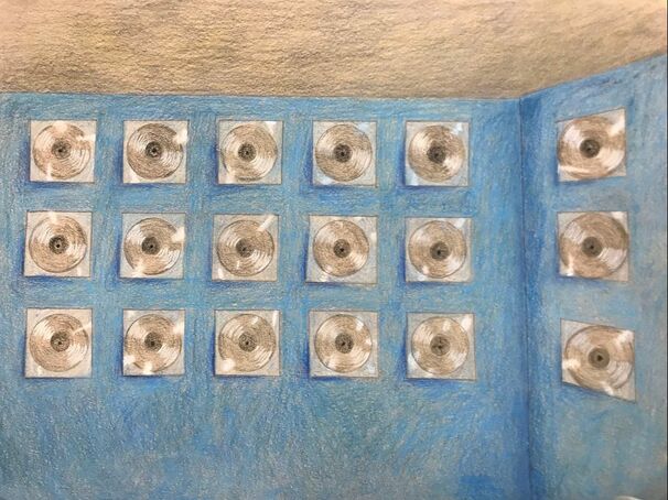
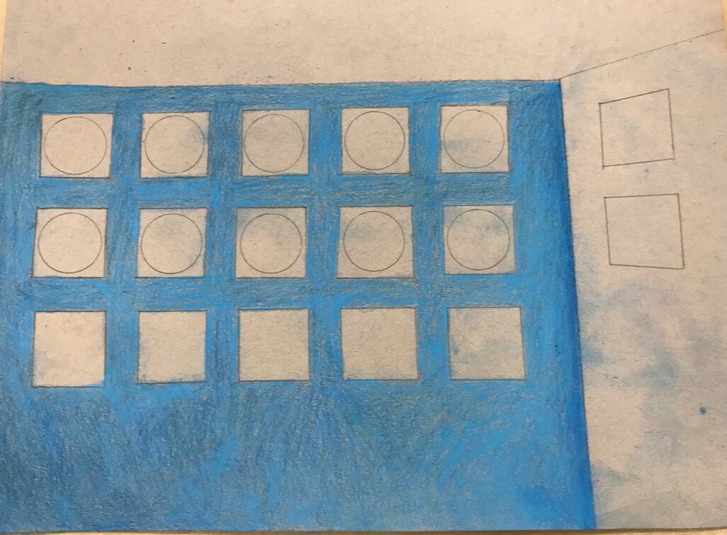
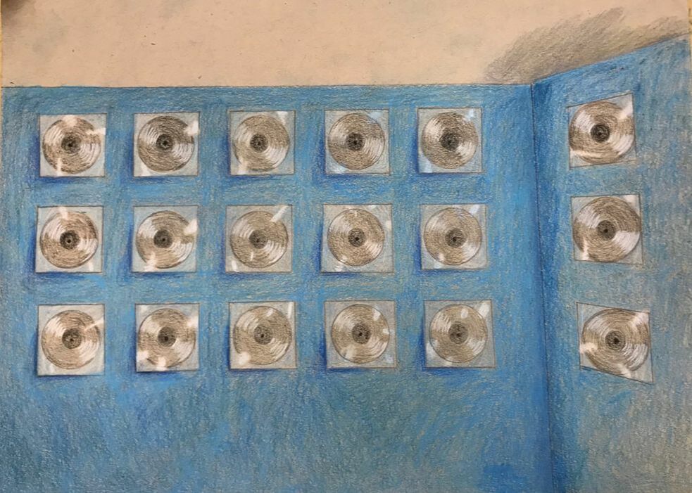
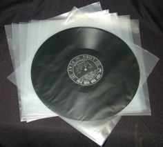
For my opacity project I chose to draw records in plastic hanging on the wall. For this I used one point perspective. I had a hard time using the one point perspective on the records on the side wall because they're circular and I had to try to make them more ovular but I didn't want to make them look significantly larger than the other records. I think that the drawing really started to turn out when I added the highlights on the records and when I added the shading under and to the side of the plastic wrap. Trying to do different shades of black was a little difficult because I felt as though the records weren't dark enough but I couldn't make them too dark because the middle is darker than the outer part. I used colored pencils for the majority of the drawing but I added blue chalk pastel for the wall as a way to help blend the three shades of blue I did in colored pencil. I also used the darker blue chalk pastel in the corner to show that it was a corner and help give the room depth. Looking back I think that the darker blue could be blended out better. 1. The craftsmanship of my piece is okay. I think it's a bit messy because of the chalk pastel and the lines aren't the straightest but overall it's not too bad and it does convey the image I wanted it to. 2. (skip question) 3. I really like the blue color I used for the walls and I used multiple different colored pencils plus a chalk pastel blended together in order to get that color. It contrasts well with the gray ceiling and the black of the records as well as the white highlights. 4. Like I said in the last answer, I think that the colors I used helped create a contrast especially by adding a darker shadow to the records. 5. The only texture I really used in my artwork was on the ceiling and I think the different values of gray is what created it. The highlights are what created the opacity in the drawing because it showed that you could see through the plastic cover and it was covering the records. The other highlights I did on the records showed how the light was hitting them and helps it keep it's round shape. The shadows I used were behind the records and that helped make them look mounted on the wall rather than part of the wall and the other shadows in my drawing was in the corner of the room as a way to show the depth in the room. 6. Honestly I chose the blue color for the wall because that's the color of my room and I really like it. It ended up working well with the records to create a contrast because of how bright and deep it is. 7. I used colored pencils for most of the drawing because to me it's easier than pastels because they're less messy and have a wider range of color. I also used the blue chalk pastel over the colored pencils for the color of the wall because I felt as though the three shades of blue weren't blending enough and they weren't bright enough and the pastel helped blend it all together nicely. I'm glad we've done multiple practice drawings with both pencil and pastel because it helped me learn the techniques I used in my drawing. 8. The most difficult part of this drawing for me was the one point perspective because I kept feeling as though the side wall and the records on it didn't look right and I wasn't sure exactly how to distort it so that the records were more ovular but still to scale. I also had trouble with using black colored pencil because it's easy to make it too dark too fast and on the records I needed two different shades but the lighter one never looked dark enough to me but that made it hard to have a significantly darker inner circle on the record. Compositional Sketches and Reference Images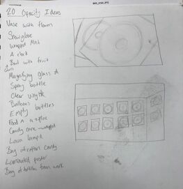
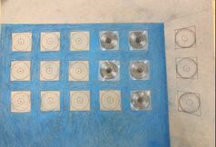
For my ideas for the opacity drawing a lot of them were glass so I couldn't use them and I didn't want to do something similar to a lot of other people like putting something in a plastic baggie so I came up with the records. I thought about just doing a stack of records but then decided it would look cooler on the wall and that would allow me to use more color by doing the blue wall. I used these two reference pictures to help with the highlights on the records.
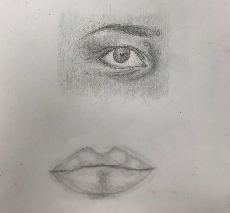
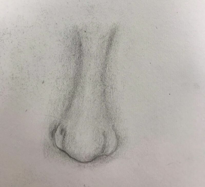
In order to practice facial features we watched do's and dont's videos and then took pictures of our own facial features and drew them. The best way to start off this post is probably for me to just flat out say my drawing career peaked with that eye drawing and I'll probably never be as proud of another drawing.I think it looks decently realistic and the shading helped give it a lot of depth. The only thing I would change would maybe to give the eyebrow a little bit more of an arch because the right end is a little bit straight across. Even with that critique though I still really like how the eyebrow turned out especially because I made sure to add stray hairs to make it more realistic and I drew it with individual hair strokes. In summary, that eye is the best thing I've ever drawn and will probably ever draw. The lips could definitely use more shading the highlight is way too sharp and it could've used more shading around it so that they would look more real and my cupids bow is nowhere near as prominent as I drew it. I struggled a lot with the nose and how to shape it. I think I needed to use more shading rather than harsh lines to form the shape of the nose. It also looks too skinny and hourglass figured.
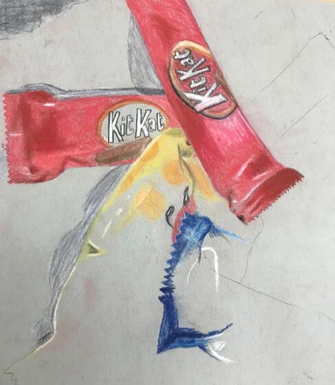 To practice opacity we drew candy in wrappers. I obviously didn't finish this drawing but I think I did a really good job blending all the colors and shading. The shading definitely helped give the candy and their wrapper a shape. The thing I most had trouble with was the sizing especially in relation to each other. Even after I sketched it out I kept changing what I had sketched because it didn't seem to look right or equal to the other candies. Looking at the drawing now I think that the Kit Kat bar on the top right is still too skinny. The other hard part was trying to add all the details in the wrapper like where it said Kit kat and had the small picture of a Kit Kat bar on it. The hard part about that was just drawing so small and trying to get all the details in and I don't think I did a very good job with that. Overall though I think if I had continued the drawing it wouldn't have ended up too bad.
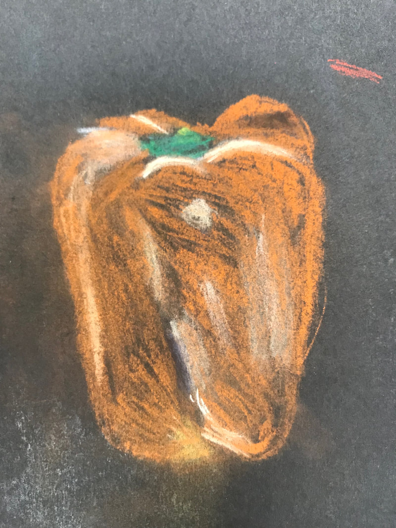
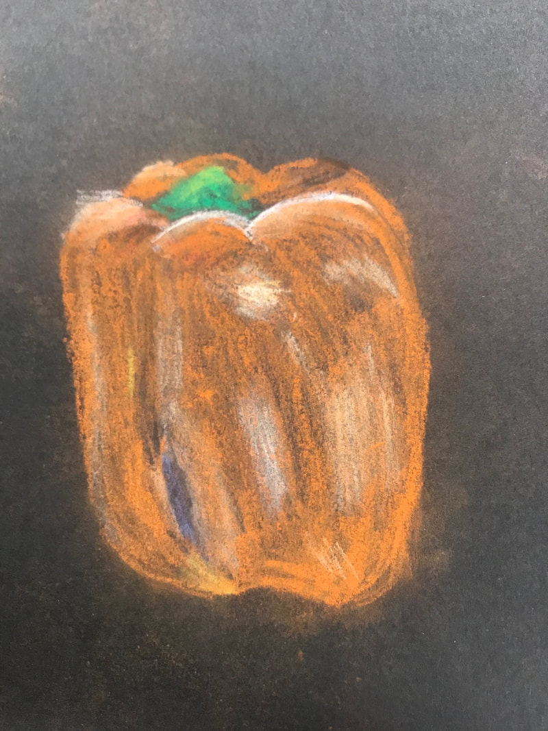
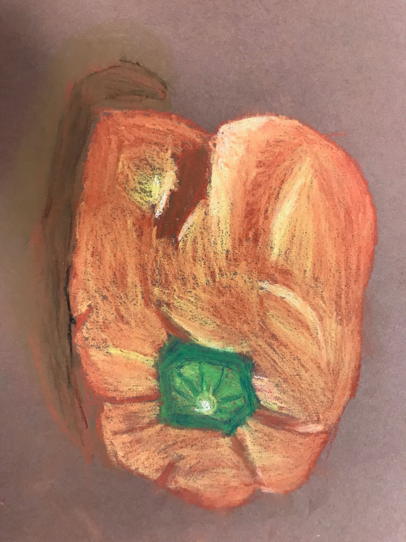
To practice drawing with chalk pastels we drew a piece of produce. Mine was a pepper. The first two pictures were my first that I drew. The first and third picture I drew with normal chalk pastel and the second and fourth picture were done with chalk pastel pencils. I think that the peppers turned out pretty well and they did an okay job at showing texture and three dimensions. I think that what I could still work on is the shape of it so that it would look more realistic and three dimensional.
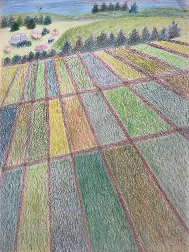
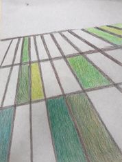
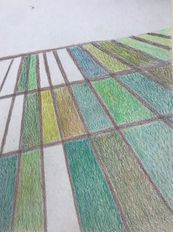
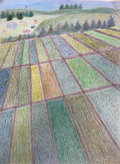
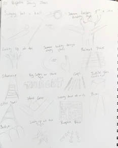
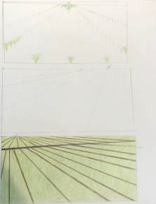
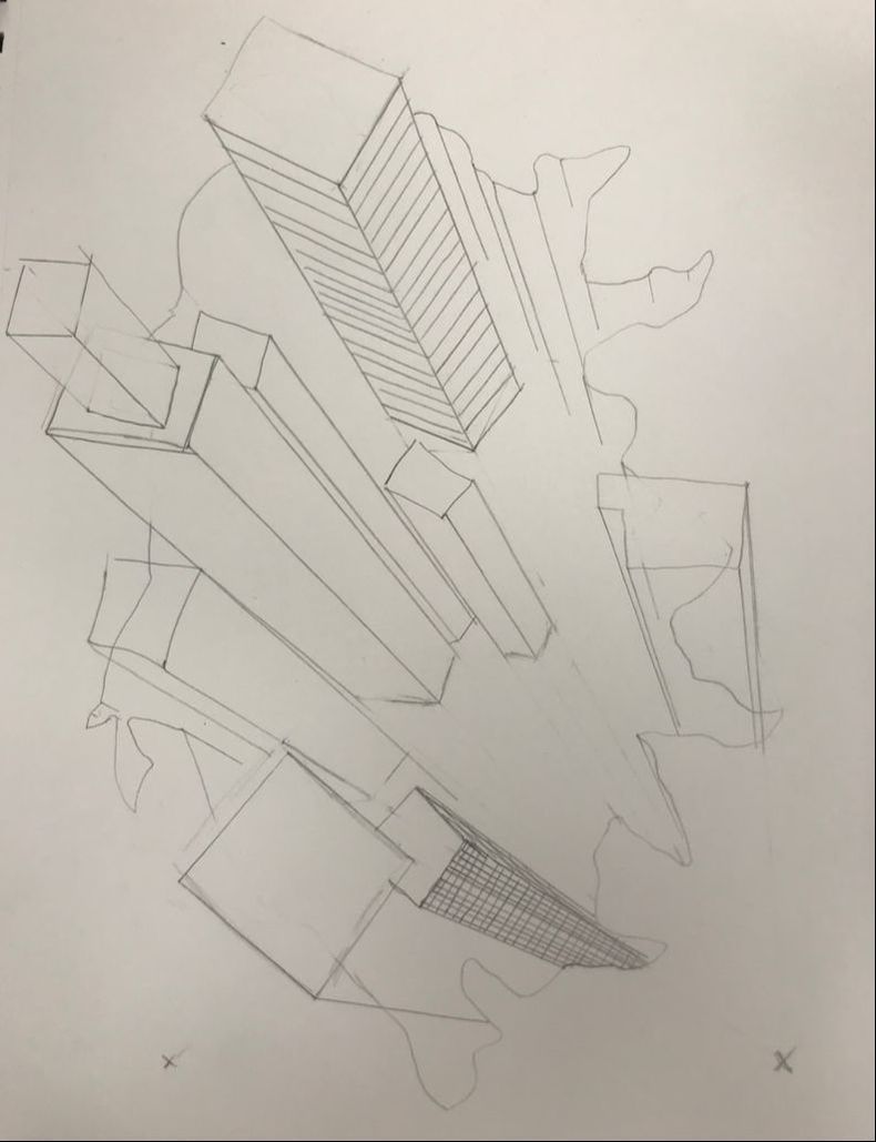
1. I created an interesting point of view using one point perspective. I got the idea when thinking about when you drive past fields of crops and all the rows are perfectly even and straight and they start to look diagonal as you drive by. I think it was successful because it showed that perspective well. 2. It's important to understand perspective so that you can draw in the same way that something would be seen. It also helps you gauge how to size an object and give it depth and three dimensions. 3. The colored pencil exercises helped me learn how to incorporate different colors into my drawing and I think that added a lot of detail and texture to my drawing. 4. I think that I used the colored pencils really well and I blended well and the different colors added made it look very nice. I looked on the website for an article that explained how to use colored pencils to draw grass and that added a lot of texture to my artwork. 5. The thing that I think I need to work on is the background because I don't think that the grass looks like it's the ground and then meets the horizon where the trees are. I think that if I had done the drawing with the paper landscape then it would've helped achieve depth. 6. This project was fun for me to do and the colored pencils are fun to work with especially when I'm working in the other colors. The grass strokes took a long time to do because there was so much of it to do but once I learned to do that it definitely made it look much better and textured so that was an obstacle and an advantage. When I had first drawn the trees they looked good and were lighter but when I drew in the hill behind them they blended in and I had to spend a lot of time darkening them and lightening the hill to give it a contrast. 7. Sizing is something I still need help with because I think the houses I drew are way too big. Some are the same size as the trees and they should be smaller than the trees and they should be smaller because they're off in the distance. I also think my trees don't look very real and I need to work on giving the drawing depth. Compositional Sketches
When I brainstormed my 20 ideas for a perspective drawing I decided on the crop fields because I felt like it was the most unique of them all because there's lots of examples of perspective being used for something like a railroad or tower or staircase. After doing my three sketches for the crop fields I ended up doing my drawing similar to the bottom sketch but with more alterations like I divided it into three sections instead of two and added more of a landscape in the background.
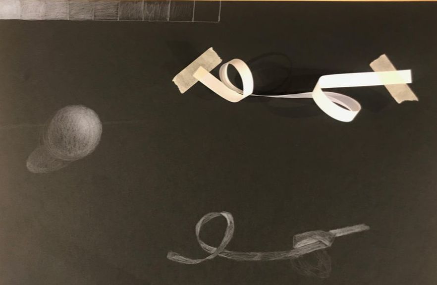 For the assignment we practiced using white colored pencils on black paper. It was definitely harder to draw than it looked like it was going to be but I liked doing it and I think it turned out okay. Some of the edges are a little sharp so I need to work on that but I think the shading was well because I did it all in the direction that the ribbon was going and I did well showing the way the ribbon curved.
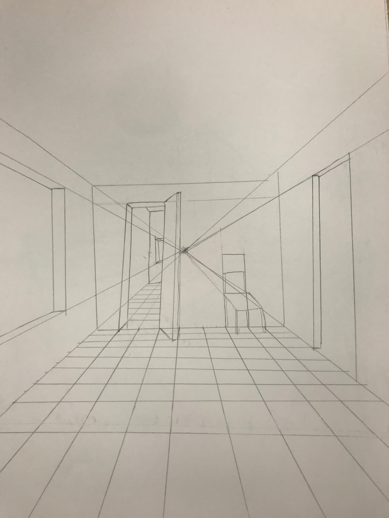
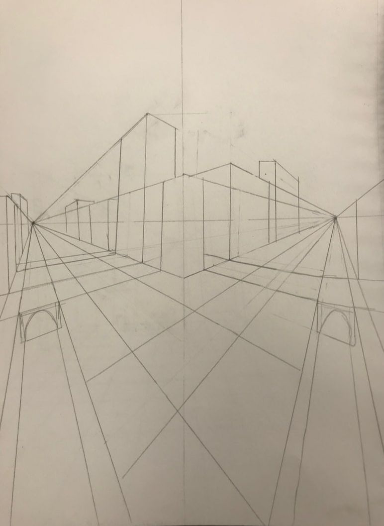
For this assignment we watched how-to videos on how to draw from different perspectives and followed along with the video. I think my drawings turned out well and if I had continued with it and added details then they could've looked really good. I struggled with the 3D one a little bit so that one wasn't my favorite to do but it was good to see how that's done.
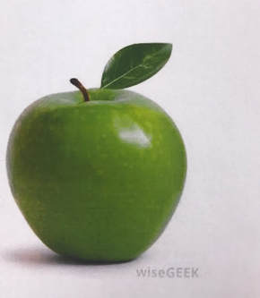
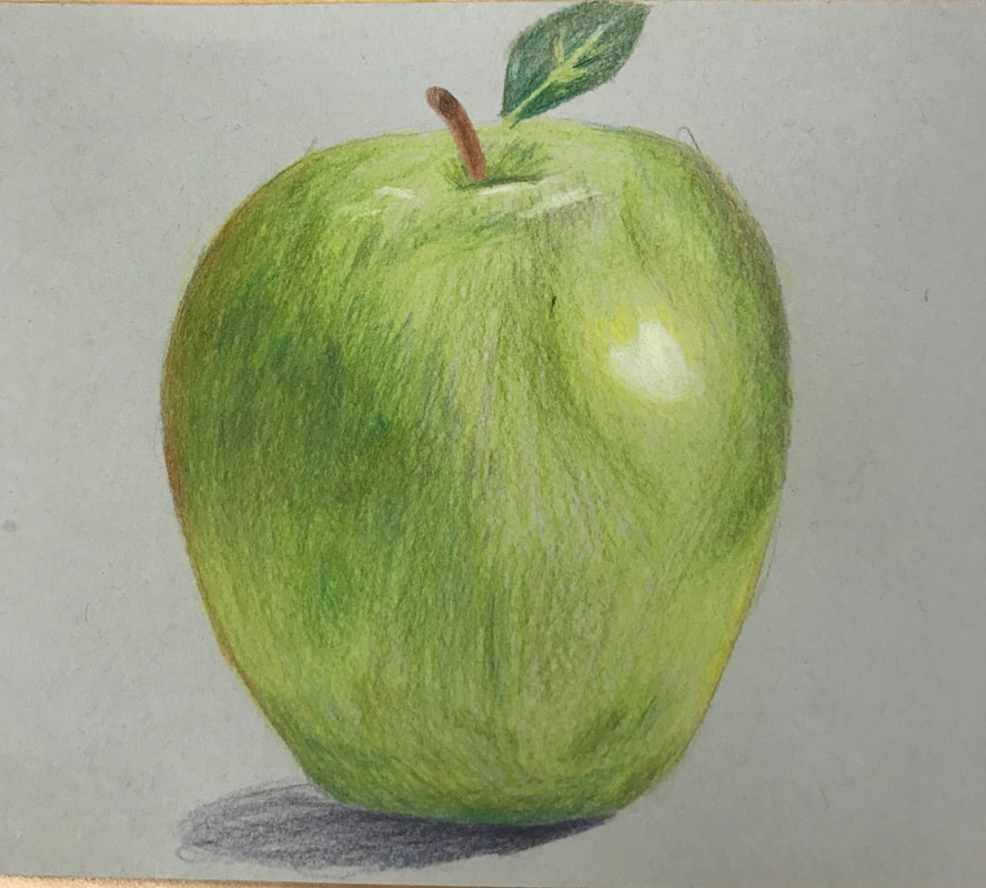
To practice using our colored pencils we drew fruit and were supposed to use colors that we might not necessarily see very easily. I like how I shaded and blended all the colors. I used a lot of yellow and some orange, brown, and purple in the apple along with the obvious green and I think it helps gives it more dimension and makes it look 3D. I also think that the highlights look really good in my drawing and you can see a clear light source.
Final Product and Reference Photo
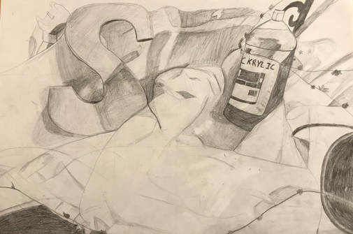
In progress pictures 1. I think I did well with blending but I don't think my edges are very clear and it's not easy to differentiate between objects. There are a lot of finger smudges that I didn't mean to have but ended up happening all over my page.
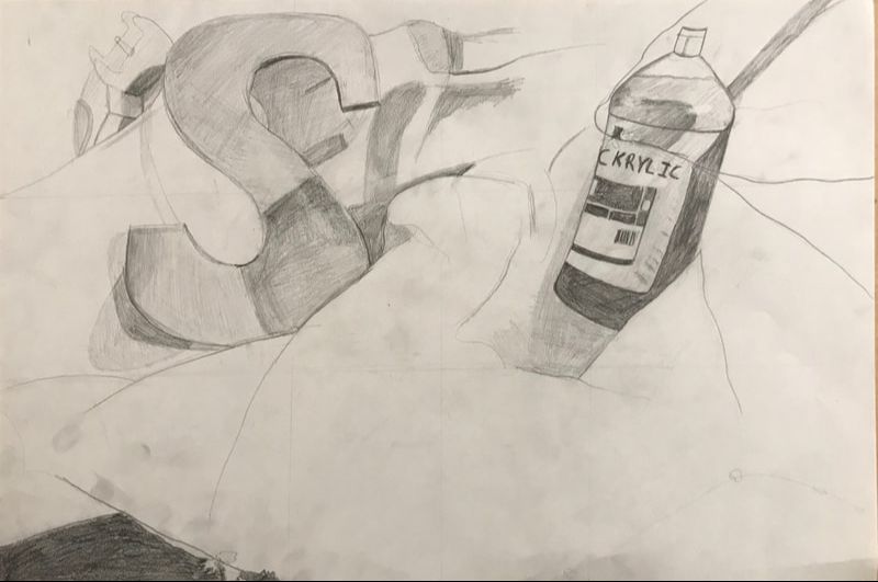
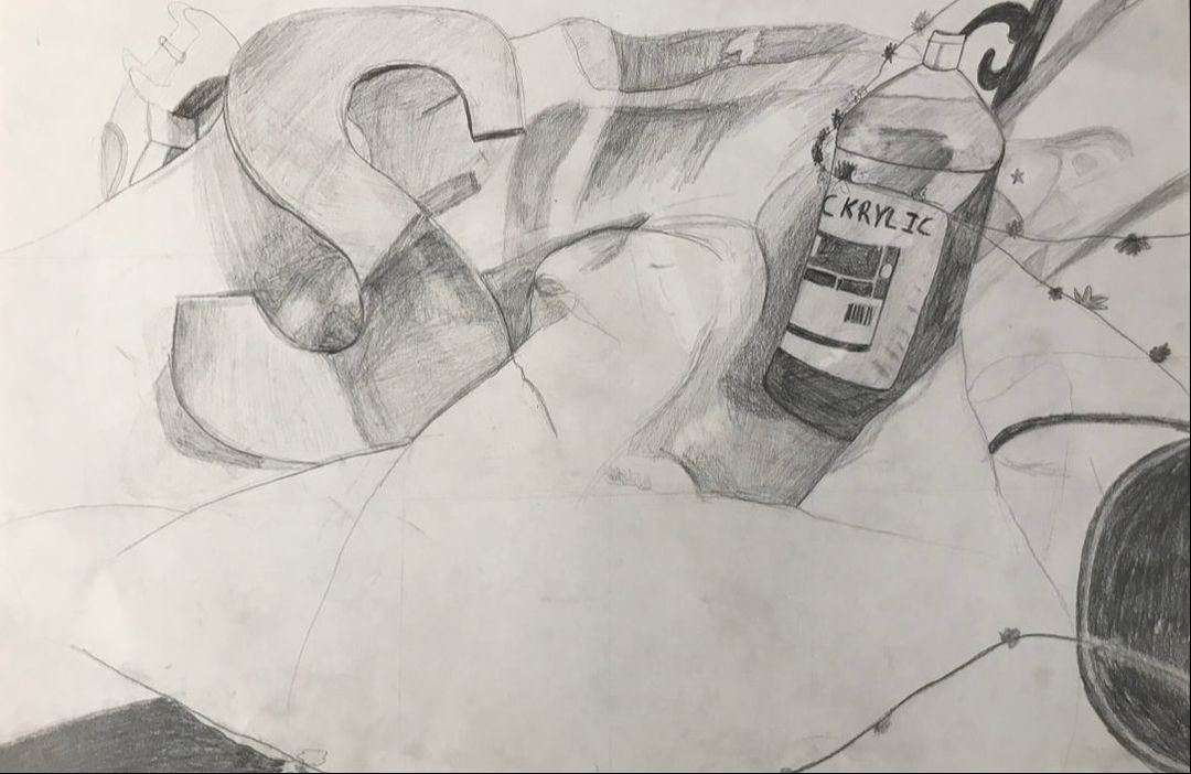
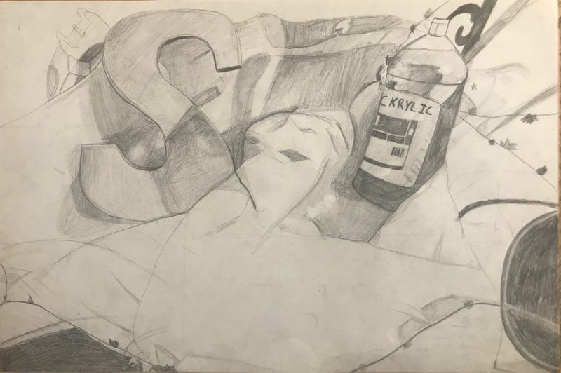
2. I tried to make my shadows and values as realistic as possible and to incorporate as many values as I could so that it would help give the drawing dimension and make it look much more realistic. 3. I don't think the light source is clear because I have shadows in a lot of different places and so it isn't very obviously coming from one direction. 4. Personally I don't think the compositional sketches were that important in my final piece. The only way they influenced it was by helping me choose which part of the still life I was going to draw as my final. 5. My final drawing was successful in the way I shaded and used value throughout the piece. I think that the paint bottle I drew looked good and like it was 3D. 6. I think the proportions were off because I have a lot of trouble with spacing when I draw and I ended up not drawing the "S" or the paint bottle big enough. 7. When I picked the composition for my final I tried to use the rule of thirds so I have the top two thirds being the main part that had the objects and then the bottoms third was mainly fabric and there wasn't too much of a center to it. 8. I don't think there's much of a center because I tried to avoid having anything straight in the middle. The center of focus is kind of just the area between the "S" and the paint bottle 9. My time probably could've been managed better because there were times I just kind of stared at my reference picture and couldn't decide where to start because the amount of details that needed to be incorporated to make it a successful drawing was a little bit overwhelming. The first class period we worked on it I didn't start for like thirty minutes because I couldn't decide how to space everything and anything I drew I would erase. My time could be managed better by coming up with a plan before starting and just going with whatever I draw instead of erasing everything. 10. My biggest challenge was probably the fact I was timid about starting it and also drawing the fabric. I wasn't sure how to give it texture and show the movement of it and so I had to just keep shading it wherever I saw shadows until it finally looked more and more like fabric although I still don't think it looks very good. 11. I learned how important using value is and how it can change the entire drawing and bring it to life.
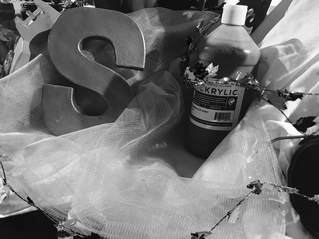
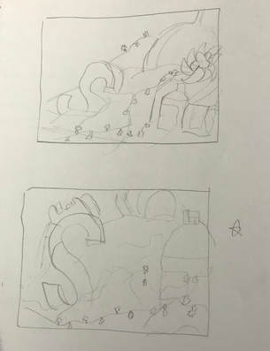
We used a view finder to draw six compositional sketches of the mass of objects and fabric on the table in the center of the room. I had a very hard time with this because there was so much going on and it was very hard to draw it all. Because they were only compositional sketches we didn't use value and they weren't very detail oriented. I think the lack of value makes it all look flat and the lack of contrast makes it so it's difficult to differentiate between objects. I chose the last sketch to be the one I draw for my final.
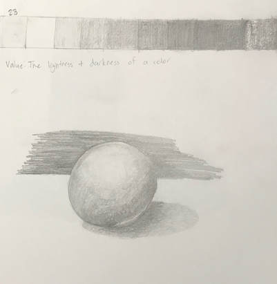
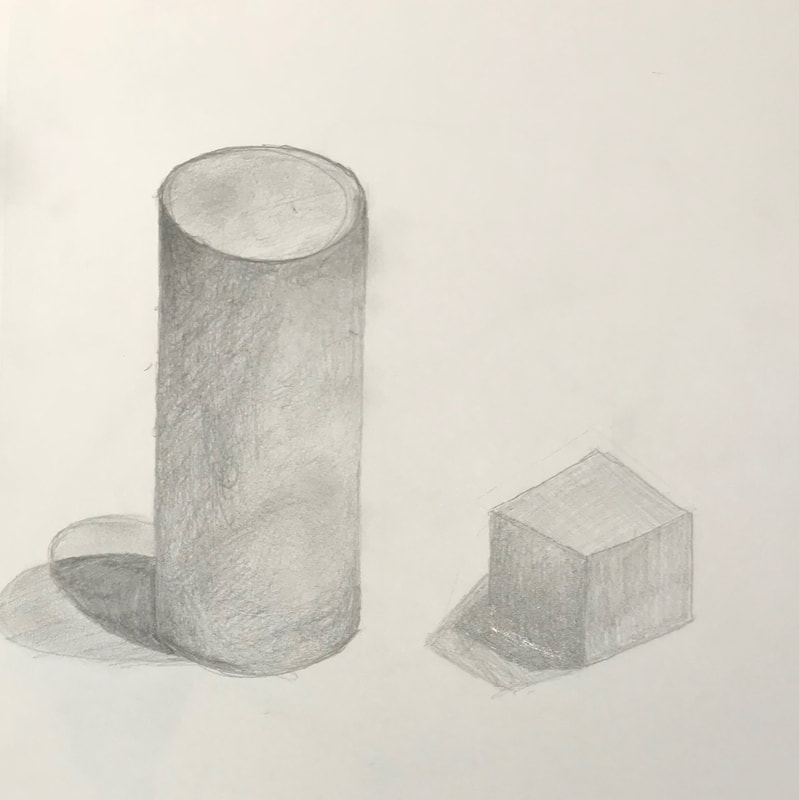
t We learned about value and how different types of pencils and the pressure you use affect how it looks on the paper. It was hard to maintain an even pressure at first but I think once you get used to it it's not too hard. Value definitely helps add dimension and form to a shape. I think my circle turned out decent, it's not very smooth and looks like it has edges but I think if I were to try it again I could make a pretty decent one. It would also help to use a blending stump. I like how my cylinder turned out and I think it looks decently 3D. My cube definitely needs some work mainly because I can't draw straight lines for the life of me. If I had the angles right and the lines straight I think that it would've looked much better.
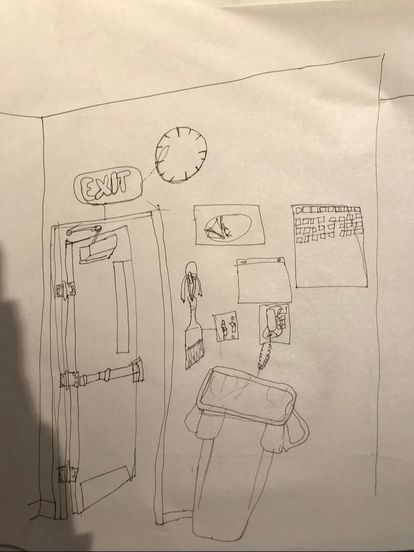 Starting the room contour drawing was overwhelming because I couldn't decide where to start. I'm very much a big picture person and it's hard for me to just draw one thing before moving onto the next so having to start in one section and drawing everything there before moving on was difficult. I think that if I could actually draw a straight line then the drawing would look much better because it looks very messy. I have trouble with spacing and sizing too so it's hard to map out a room because I'll end up not having enough room for an object or the room will look flat, etc. I think the shape of the room isn't shown well at all. I did run out of time when drawing so maybe I could've added more dimension and details if I hadn't but I'm kind of stuck on how to do that.
1. I did use a fluid line, you can tell because all the lines are connected and I didn't pick up my pen while drawing. 2. Although I didn't like this final drawing it would've been way worse if it had been my first contour drawing. Doing other practice drawings definitely helped me practice my technique and learn how to draw along with my eyes and to draw one section before moving to the next. 3. The contour line drawing is different than an outline drawing because you can't pick up your pencil and if it were an outline drawing then you wouldn't draw any of the details or the inner lines. 4. Interpretation of line is essential to capturing the look of the room because it helps show the volume and dimensions of the room. It's important that the line achieves that because there is no value added in a contour drawing. 5. Doing this drawing helped me learn perspective a little bit better and spacing. I think I still need to work on that a lot as well as drawing straighter lines if I were to do it again. I would also probably add more details.
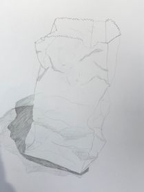
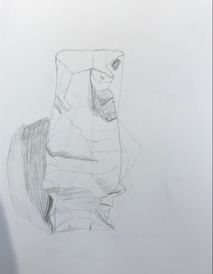
The paper bag and fabric drawings were difficult they were very textured and had a lot of value. I would find myself drawings lines and then when I go back to that section not being able to remember which crease in the bag that specific line was because there were so many. I think my first paper bag drawing turned out better than my second one but there was less of a range in value. My fabric drawing is just plain horrible and I don't have much of an excuse for that. I think it was really hard to draw in a way that was fluid and soft the way that fabric is and I definitely struggled to mimic the fabric.
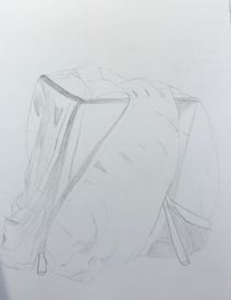
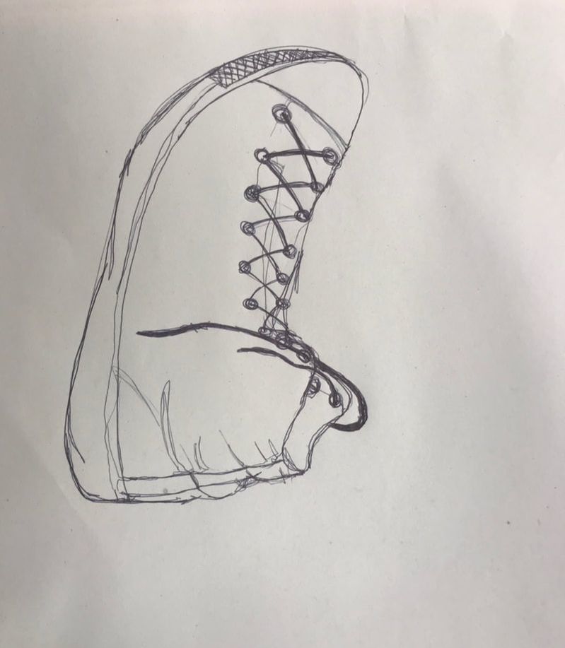
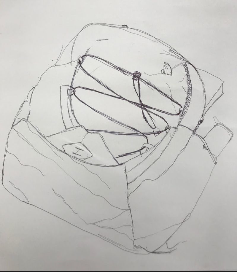
These contour drawings scared me at first because they're a lot more detailed than a hand is. I think the shoe turned out pretty well, parts of it do look decently three dimensional and one of my concerns when I started drawing was that it was going to look flat. The backpack was harder for me and I think that showed a little bit. There were so many details and it was hard to show all the different layers and textures of it. I think it looks too flat and you don't really see very well how the fabric was folded in some areas and how it covered other parts of the backpack.
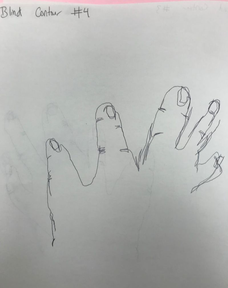
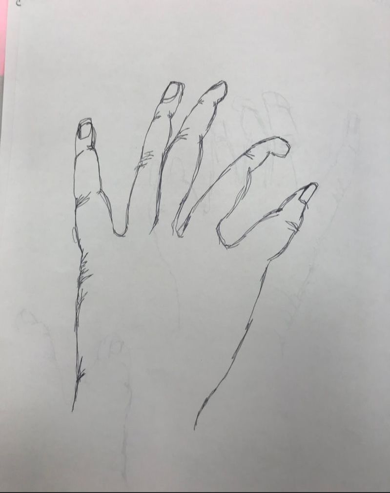
Blind
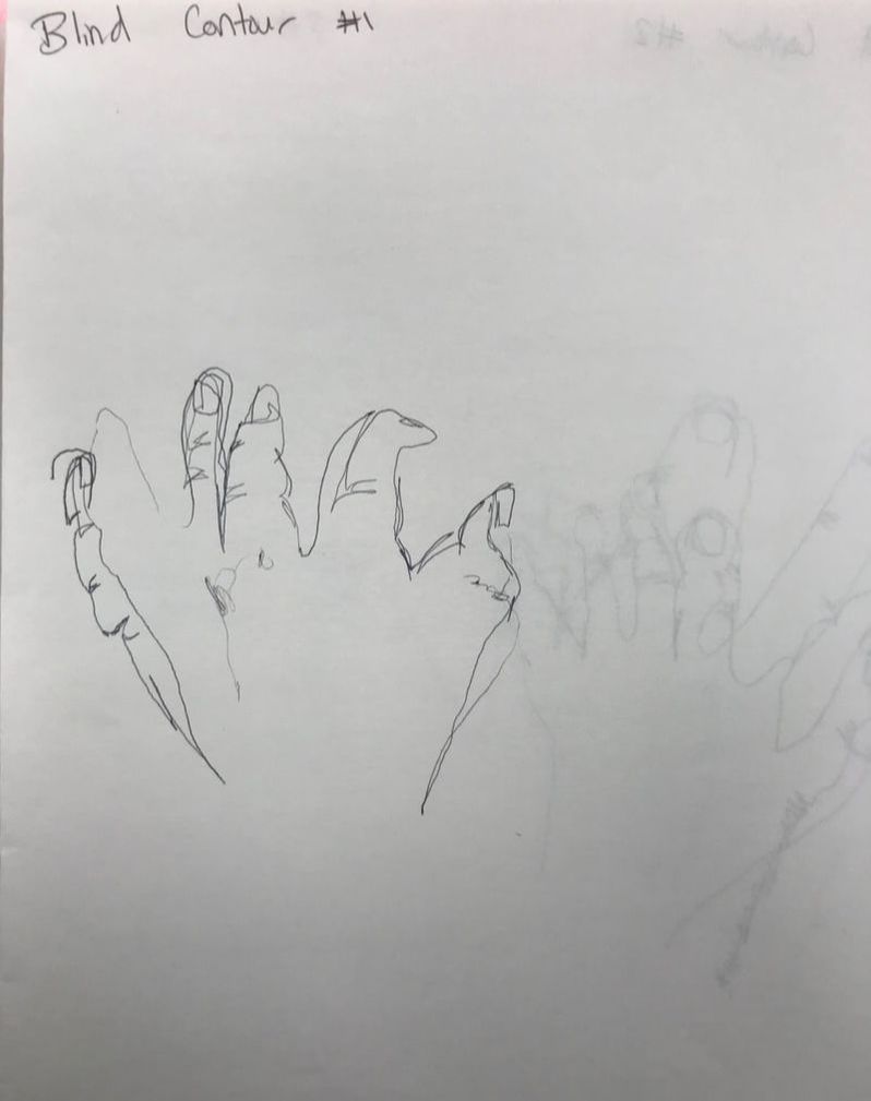
The first four contour drawings we did of our hands were blind. Hearing that we were going to draw without looking at our paper definitely stressed me out. As I was drawing I thought they must've looked terrible but I was actually really surprised with how well the first one turned out and I think that one is the best one that I drew. The hardest part for me was the size because in the last three drawings the pinky was actually the finger all the way to the left but they all ended up being the biggest finger and the thumb the smallest. I think I just kind of overthought it and I didn't want to draw to draw too big and I ended up getting smaller and smaller as I drew. Modified
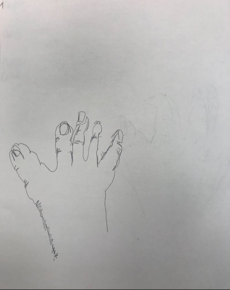
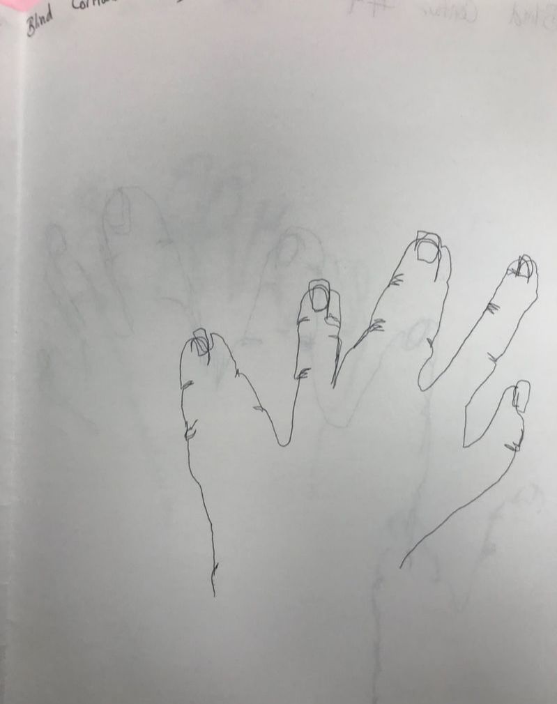
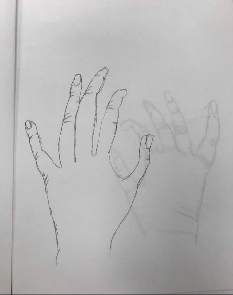
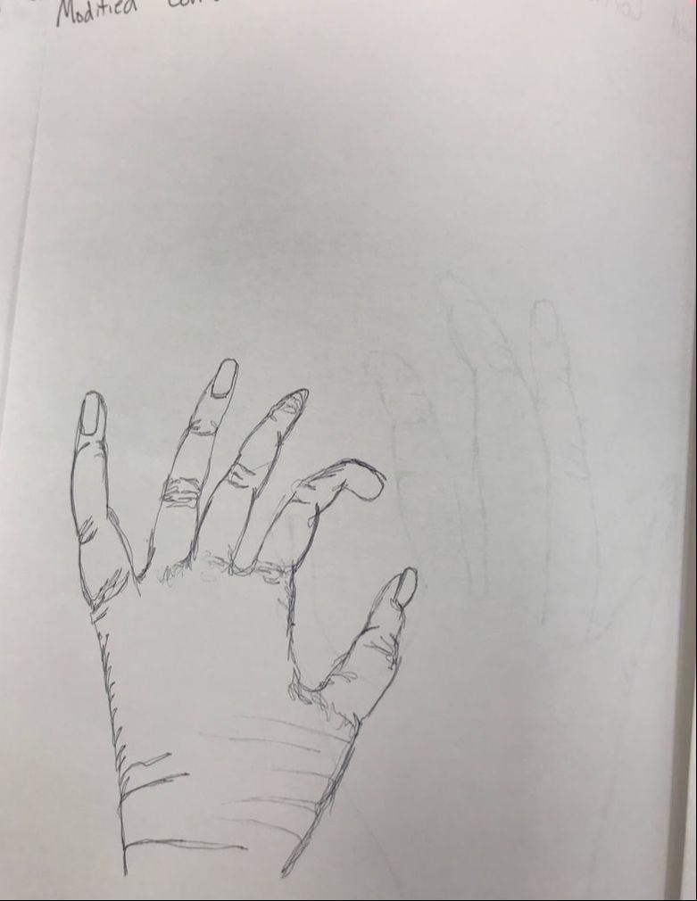
The last three contour drawings we did we were allowed to look at our paper while drawing. I definitely draw better while looking at my hand because I can just draw every line that I see and it was obviously much easier to be able to see what I was drawing. The first two you can see I was a little hesitant about going inside and drawing lines there but by the third one I did and it looks much better and more detailed. The size and proportions of the hand were much better than my blind ones. Looking at them now I do actually think they look pretty good and I'm proud of at least the third one.
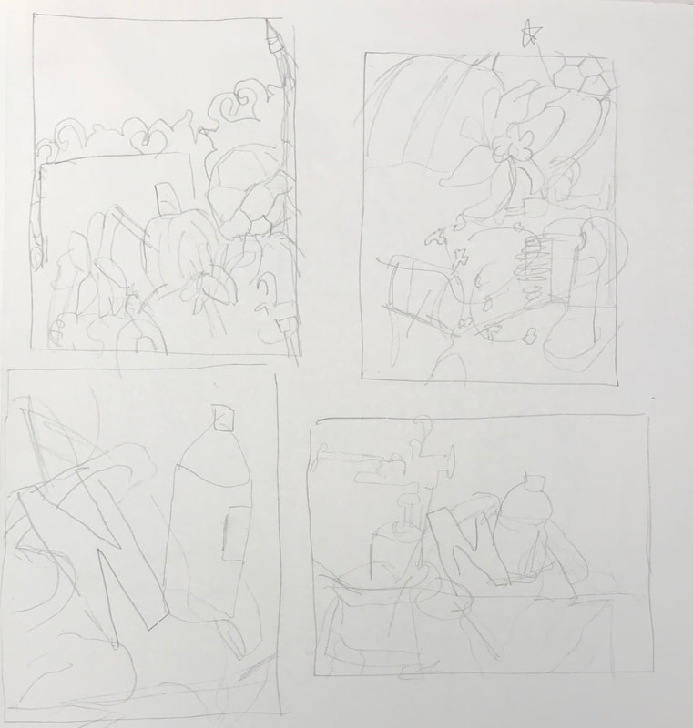
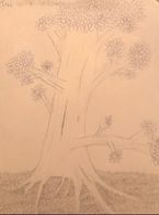
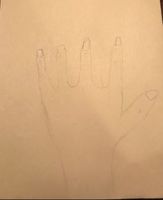
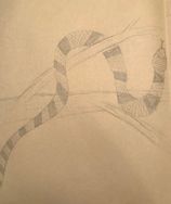
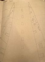
The first assignment we had was a benchmark activity as a way to measure our growth throughout the semester. We drew a tree in a landscape, a hand, an animal in a landscape, and a street scene.
|
AuthorWrite something about yourself. No need to be fancy, just an overview. Archives
January 2019
Categories |
 RSS Feed
