how to use value and how to blend. Value was especially used in the eyebrows to make it look like the hair was layered and to make it look like 2D. I used the blending stump a lot on the nose too and on the lips to give them more dimension. I especially like how she gives off a strong presence and expression. I think adding the piercings also added to that presence and gave her a bit more originality.
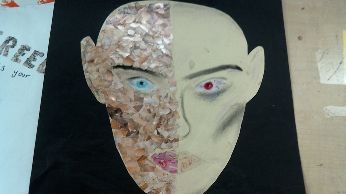
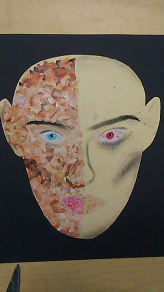
and the media force us to mask ourselves a lot of the time since one side of the face is literally masked by the media because it's a collage. I hadn't done a collage yet this semester and I really enjoyed it although all the tiny pieces ended up taking more time and being more frustrating than I would've expected it to be. I used charcoal on the right side to contrast the left. it was supposed to give it a more dark and hardened look. I think the cheekbones were done exceptionally well and gives it a sunken in look that can even come off as scary. I used oil pastel on both sides to give the piece more shape. I did the eyes in the two different colors to give them an interesting juxtapostion and contrast between the two sides and on the right I used the oil pastel to give the eyes a darker look and big bags under the eye. I also highlighted certain areas of the face to give it less of a 2D shape. I used the peach to highlight the cheekbones, inner eye, the brow bone, the middle of the forehead by the eyebrows, and the cupids bow. Using makeup helped me a lot with this piece because it gave me background knowledge on how to give it more shape and form and so it has more of an expression.
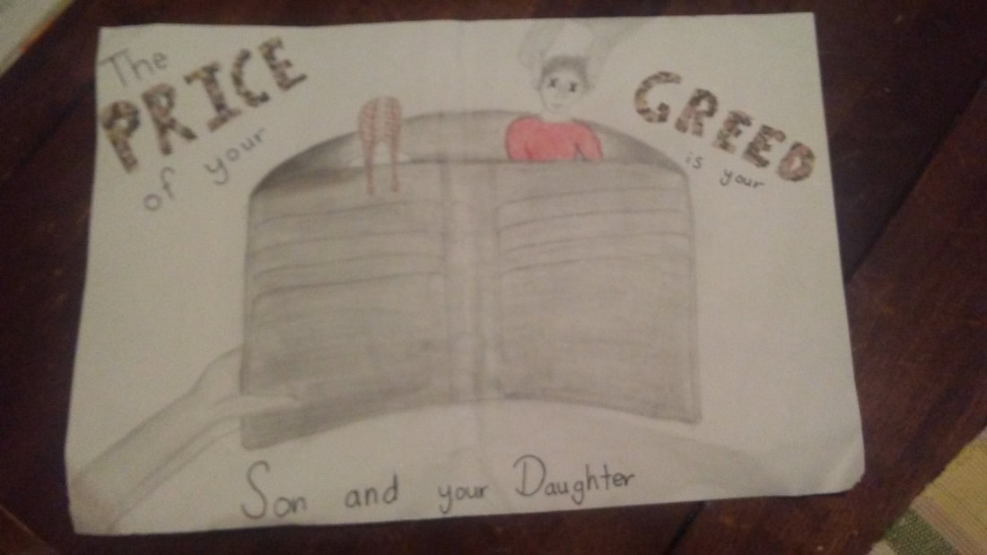
his songs about political issues and how a lot of issues from a long time ago are still prevalent today. This line "The price of your greed is our son and your daughter" stuck out to me and I wanted to illustrate it. I imagined it as someone having their kids in their wallet and literally using them as currency. I have been working mainly on my drawing skills all semester and I've improved a lot so I felt confident enough to attempt to draw it with graphite. I watched multiple videos to learn how to draw braids. I think the way she's standing with her back to the viewer gives it an innocent and naive look. The hardest part of the drawing for me was to draw the boy in the position he's in. I wanted him to be in the midst of getting dragged out of the wallet and I wanted him to have a limp look. The hands were also troubling for me because I haven't spent any time on the before and they were in unnatural positions in order to be holding the wallet and grabbing the boy by the hair. They ended up pretty good although I ran out of room at the top of my paper. I definitely need to work more on scale because the wallet is still the biggest part of the artwork and it definitely stick out. It also took me a while to get the heads of the boy and the girl the same size because I kept making the boys head too small. I had to learn how to use value on the wallet because at first it wasn't looking very 3D and adding value was supposed to reflect the darker meaning of the artwork. I added color using colored pencils at the last minute and I think it added a lot to the piece. The color in the girls braids added to the idea of innocence I wanted her to convey and helped her pop off the page, as did the red shirt on him. It helped them stick out in front of the background of the wallet opening and also helped place them as being behind the foreground of the wallet. I also added a collage aspect by filling in the words price and greed with a cut up copy of a $50 bill. Money in general is symbolic for a lot of things especially something like greed which is why I think it successfully added to the piece. Lastly, the X over the eyes of the son is a symbol the Grandson uses on his cover art of his symbols and adds to the dark meaning of the piece. Although the boy has a face it almost makes him faceless and makes him look blank and expressionless like he's dead and I think that brings a lot to the piece.
0 Comments
 I spent a lot of time on this drawing and there's still a lot I would like to change. I got the idea from song lyrics from Blood//Water by Grandson. My main struggle with this was figuring out the correct proportions. The wallet is still way too big and kind of swallows up the children and makes it the center of focus. This also caused me to run out of room for the hand up top that is supposed to be picking up the son". The hands were pretty difficult for me to draw because I haven't worked on drawing hands before. I think the wallet could still use a lot more value added especially because it's supposed to be a somber piece. I like how I copied a $50 bill and cut it up to fill in the words price and greed because it adds another texture and gives the words a bit more impact. I also really like the braids I drew. I watched a couple videos on youtube to learn how to draw them and I think that was a really effective strategy. The addition of the X over the eyes on the son was a way to add Grandson's symbol in and I like how it contributes to the piece especially because I think it adds to the dark tone I'm trying to portray.
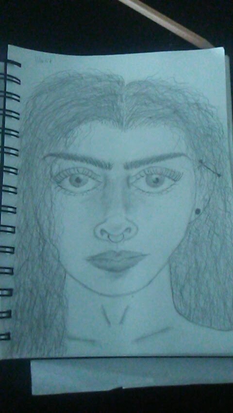 For the learning challenge I wanted to continue drawing faces and expand on it instead of just focusing on the eyes. This is probably one of the first pieces of art I've made that I've been really proud of. I think that it looks decently realistic. It's also apparent that I spent most of my time working on drawing eyes because they stick out to me the most in the drawing. The shape of her face and her jaw is done really well and I usually reference this drawing when I'm having problems drawing the shape of a face. I like that she looks strong. She almost has a intimidating look and I really like that about her. There's still a lot I need to work on like the nose and the hair. I do think that as I continued to do the hair it started to look better and better but it could still be better and more realistic. The eyes are disproportionately huge and the eyebrows are pretty close to each other. If I were to redraw this I would fix those things and try to add more small details that would make it more realistic looking. I think right now the drawing looks very 2D and flat on the paper and I want it to look more like a real person.
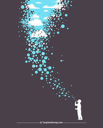
For the illusion challenge I was inspired by the surrealist work of Tang Yau Hoong. I really liked the colors and the fragmentation of his work. I made a linoleum print to try to create a similar work. I think that if I were to do this again I would better practice what I want to print before actually carving it out because the print didn't turn out to be as clean cut as I wanted it to be and it didn't end up being too neat. I think I could've better shaped it. I could also use a larger piece of paper so that the art doesn't look as crowded on the sheet and so disproportionate. I do like that I got to practice making linoleum prints and I think that if I choose to use that kind of media moving forward I'll be better at it because I did this. I also like the variation in the colors I used by mixing the inks together. It gives it different layers and gives it a foreground and background.
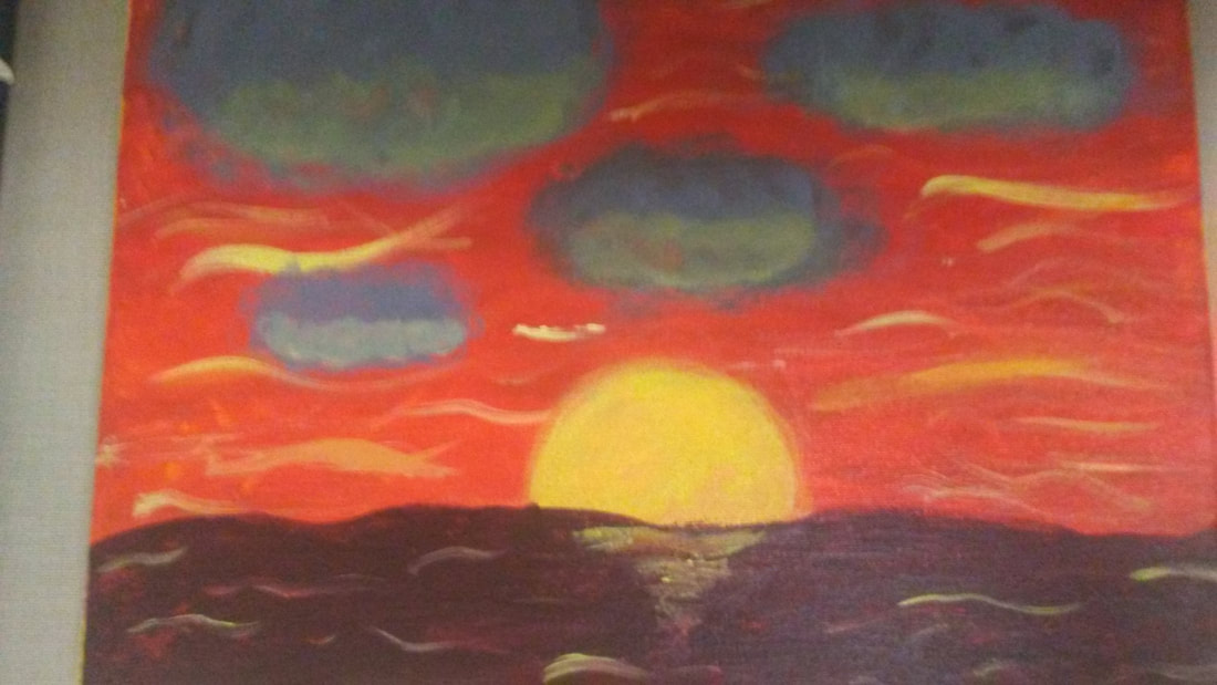
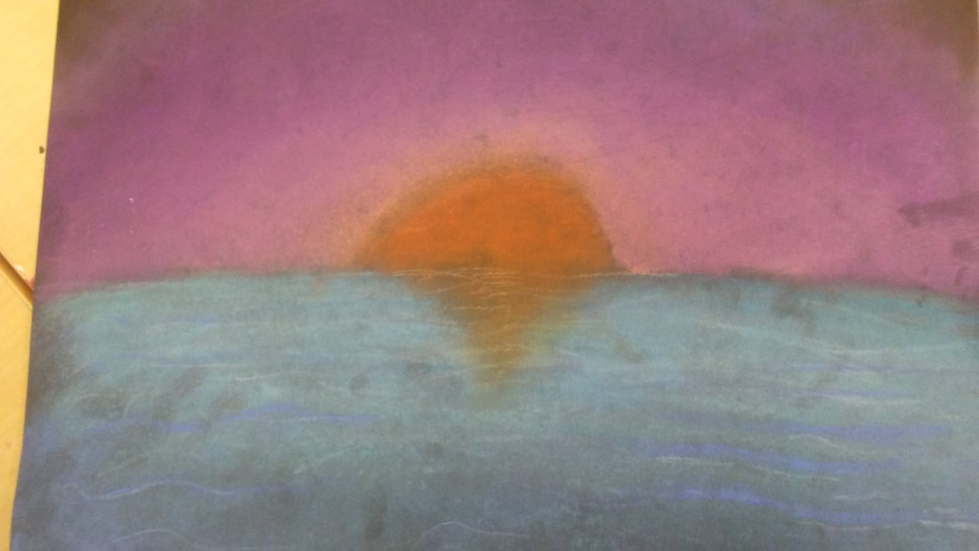 While drawing I learned how to blend the sky the way the sun would've lit the sky up. I also learned to add darker blues towards the bottom of the ocean and how to reflect the sun on the water. If I do a chalk drawing again I will try to leave less fingerprints on it.
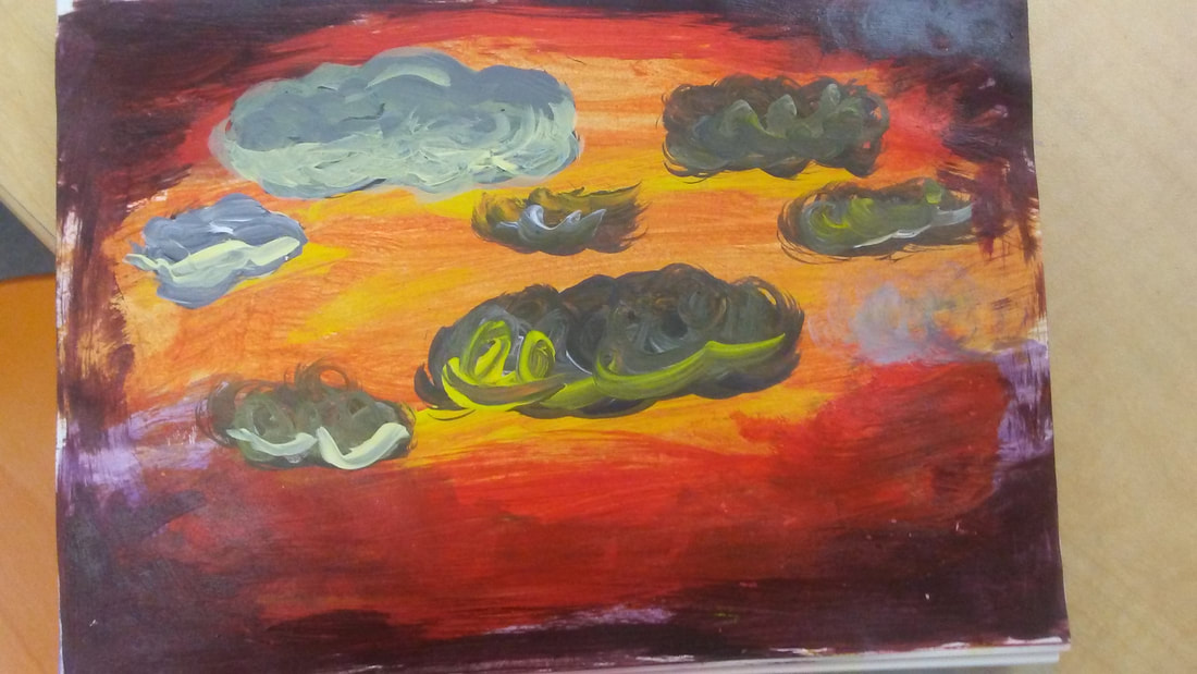
While painting this sunset I learned how to gradually blend colors for the sky, make clouds look fluffy and realistic and add the reflection of the sun in the clouds, as well as how to make the sun brighter so it contrasts better and reflects in the water.
|
MadisonI suck at art ArchivesCategories |
 RSS Feed
